

Case Study # 02
CAN BRICKS

Overview
CAN Bricks is a bricks company focused on establishing a strong presence in the Canadian market. Our team was engaged to elevate their brand and enhance recognition among target audiences.

Client Objectives
- Increase brand visibility in Canada.
- Establish a reputable market position.
- Attract new customers and partnerships in the construction sector.
Market Research
- Conducted extensive market research to analyze competition, consumer preferences, and industry trends.
- Gathered valuable insights to refine branding strategy and enhance customer engagement.
- Developed a strategic approach to effectively connect with potential customers.
Target Audience
- Construction companies looking for quality building materials.
- Architects and designers seeking reliable suppliers.
- Retailers in the home improvement and construction sectors.
Brand Strategy
Brand Naming
The name “CAN Bricks” was chosen to reflect the company’s Canadian identity while conveying a message of quality and reliability. The name is both memorable and indicative of the brand’s core values.
Brand Positioning
CAN Bricks was positioned as a premium provider of high-quality bricks, emphasizing sustainability and innovation. This positioning aligns with the growing demand for environmentally friendly building materials.
Logo & Visual Identity
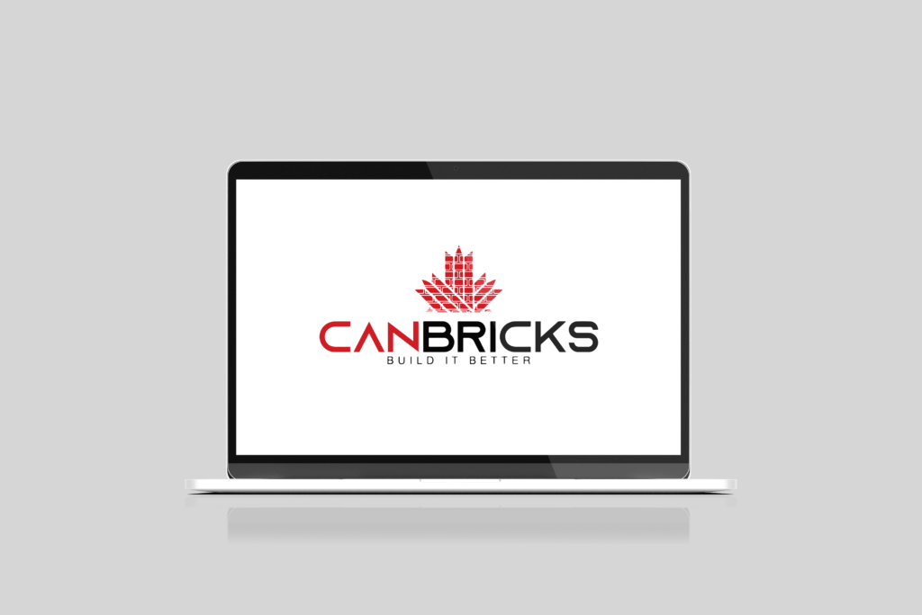
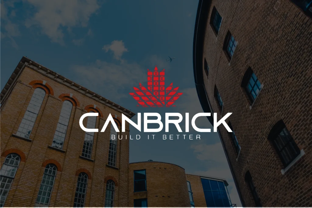
The logo features a striking red and black color palette, incorporating a Canadian leaf within a brick texture. The text “CAN Bricks” is prominently displayed below, symbolizing strength and national pride.
Logo Use
The logo is designed for versatile applications across various media, including signage, promotional materials, and digital platforms. Guidelines were established to ensure consistent and appropriate usage of the logo.
Conclusion
Through strategic branding and targeted marketing initiatives, CAN Bricks successfully entered the Canadian market, significantly enhancing its visibility and attracting a diverse range of clients.