
Case Study # 06
Sierra Pink Salt


Overview
Sierra Pink Salt is a premium brand dedicated to providing high-quality pink salt products sourced from the Khewra region. Our collaboration involved creating a complete brand identity, including a minimalistic and clean logo, packaging design, and marketing materials that reflect the purity and natural essence of the product.
Client Objectives
- Establish a strong brand presence in the competitive gourmet salt market.
- Develop a distinctive logo and packaging that resonate with health-conscious consumers.
- Create cohesive branding elements that convey the premium quality of the product.
Market Research
- Conducted extensive market research to analyze competition, consumer preferences, and industry trends.
- Gathered valuable insights to refine branding strategy and enhance customer engagement.
- Developed a strategic approach to effectively connect with potential customers.
Target Audience
- Health-conscious consumers seeking natural and organic food products.
- Gourmet chefs and food enthusiasts interested in high-quality seasoning options.
- Retailers looking to stock premium culinary products that stand out on shelves.
Brand Strategy
Brand Naming
The name “Sierra Pink Salt” evokes a sense of natural beauty and purity, reflecting the product’s source from the Himalayan mountains. It communicates the brand’s commitment to quality and authenticity, appealing to consumers who value natural ingredients.
Brand Positioning
Sierra Pink Salt positions itself as a premium provider of natural salt, emphasizing the health benefits and culinary versatility of its products. The brand focuses on sustainability and ethical sourcing, appealing to consumers who prioritize wellness and environmental responsibility.
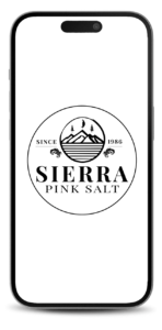
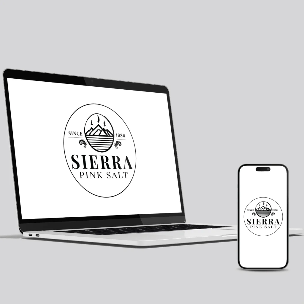
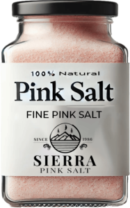
Logo & Visual Identity
The logo design for Sierra Pink Salt features a minimalistic style, incorporating clean lines and soft, Black color that reflect the product’s premium origins. The design conveys simplicity and elegance, aligning with the brand’s identity as a high-quality, health-conscious choice.
Logo Use
The logo is prominently displayed on all product packaging, marketing materials, and digital platforms. Clear guidelines were established to ensure consistent usage across various applications, reinforcing brand recognition and trust.
Conclusion
Our comprehensive branding approach for Sierra Pink Salt successfully established a strong market presence, characterized by its minimalistic and clean aesthetic. The cohesive logo and packaging design effectively communicate the brand’s values, helping Sierra Pink Salt connect with health-conscious consumers and elevate its status within the gourmet salt market.